How design and data brought a fintech web experience back to life
GuiaBolso served over 6 million Brazilians, and its mobile app was a usability reference. But the logged-in web had been left behind: outdated, inconsistent, and quietly losing trust. This is how research, design and a new system turned it around.
GuiaBolso was one of Brazil's largest fintechs, serving over six million users, both as a consumer app and as a financial-data provider for businesses.
The mobile app was a usability reference in the market. But the logged-in web experience had been left behind. Pages were outdated, patterns were inconsistent, and there was no shared system, so each update created more fragmentation instead of fixing it. For many users, especially business clients, the web was still the main access point, and conversion on financial products was low. The product was good. The web was holding it back.
A data-informed redesign that made the web trustworthy again.
One good product, and three things going wrong at once.
There was no web design system, conversion was low, and the experience needed a scalable, data-informed redesign, not another isolated fix.
Outdated and inconsistent
Different pages used different visual patterns. With no shared system, each update created more fragmentation instead of resolving it.
Losing trust before acting
When the design feels unreliable, people hesitate. On a financial platform, hesitation usually means abandonment, and that friction showed up directly in low conversion.
No scalable standards
Without a design system, every new feature re-decided things already solved, just never documented. Progress was slow and inconsistent.
Before redesigning anything, we needed to understand what was actually happening.
We analyzed usage in Google Analytics and Hotjar, mapped the main journeys, and aligned with stakeholders on goals, constraints and success metrics. The data made the priorities clear, and decisions the whole team could trust.
Numbers told us where, recordings told us why
Hotjar session recordings revealed friction that analytics alone could not explain. Users hesitated on pages that looked straightforward on paper but created confusion in practice.
Good metrics, still confusing
A page could have decent numbers and still leave people unsure of what to do next. Heatmaps and recordings showed exactly where attention scattered and where trust broke down.
The fragmentation was structural
With no shared standards, every team re-solved the same problems differently. Inconsistency wasn't a styling issue, it was a system gap that slowed delivery and undid past work.
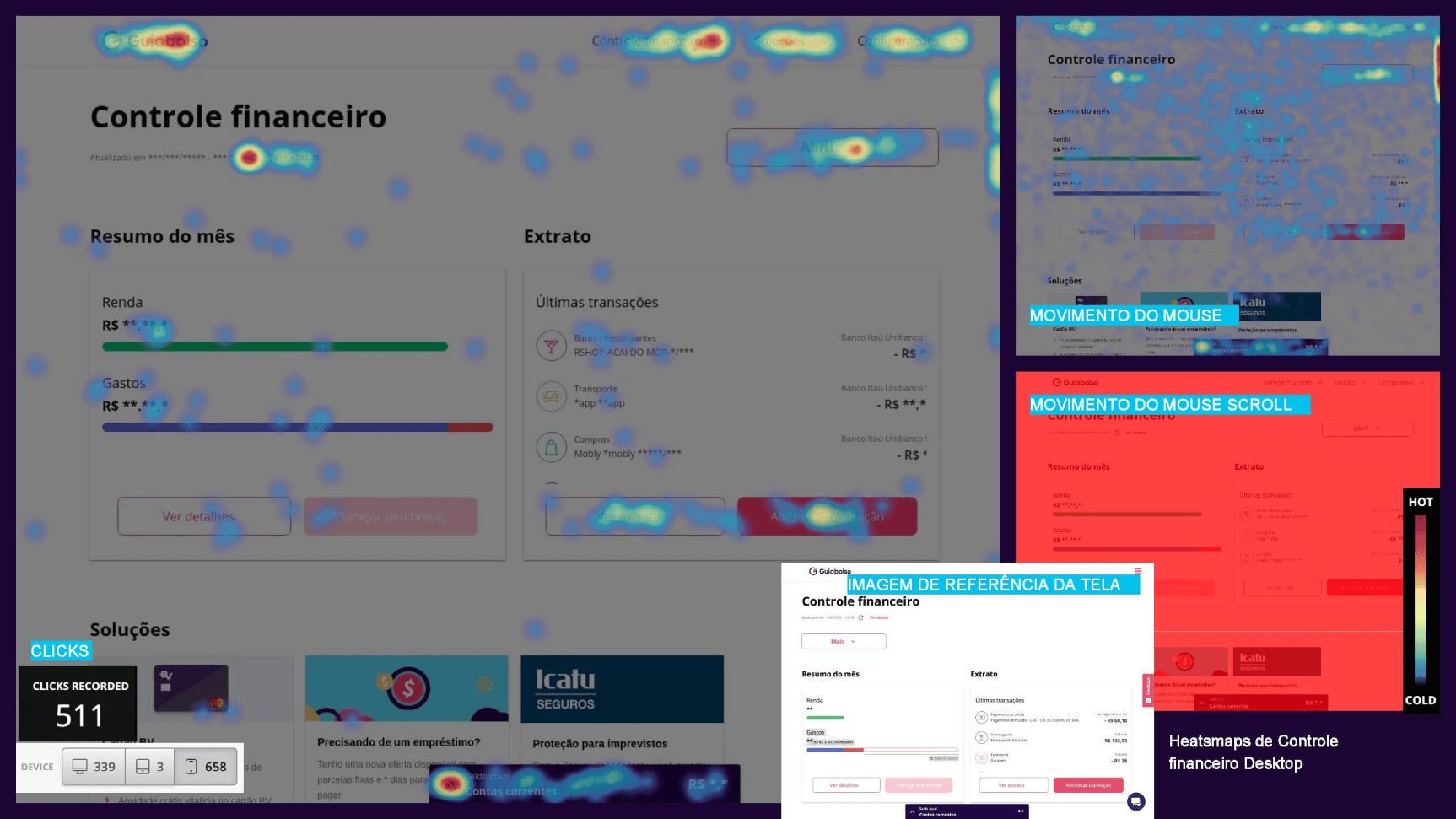
Behavior, not assumptions. Hotjar heatmaps for the Controle Financeiro page, clicks, mouse movement and scroll, surfaced the friction points that analytics numbers alone couldn't explain.
From data review to a system the whole team could build on.
Discovery & Data Review
Usage patterns in Analytics and Hotjar, main journeys mapped, goals and metrics aligned with stakeholders.
Flows & Navigation
Information hierarchy restructured and key flows redesigned to reduce friction and clarify the products available.
UI Modernization
A modern visual direction applied to priority pages, with accessibility, consistency and responsiveness non-negotiable.
Web Design System
A component library and clear guidelines to standardize the interface and speed up consistent delivery.
Testing & Iteration
Behavior monitored with Hotjar, feedback gathered, and design iterated on real usage, not assumptions.
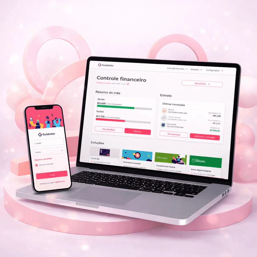
From a dated, fragmented interface to a clear, trustworthy web experience.
We modernized priority pages, login, sign-up, accounts and cards, with accessibility, consistency and responsiveness built in from the start.
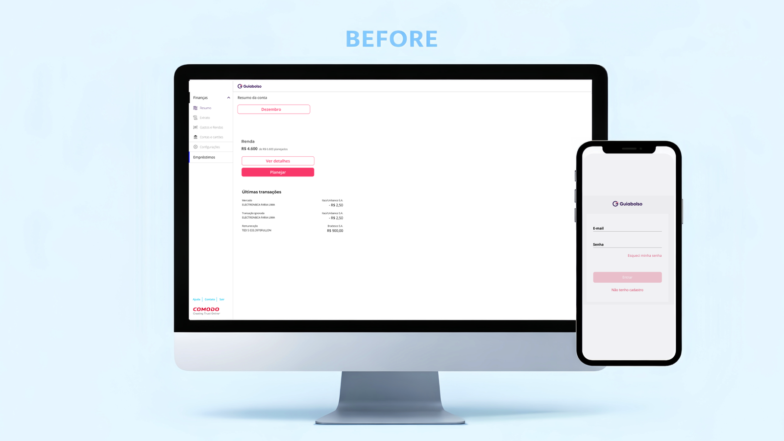
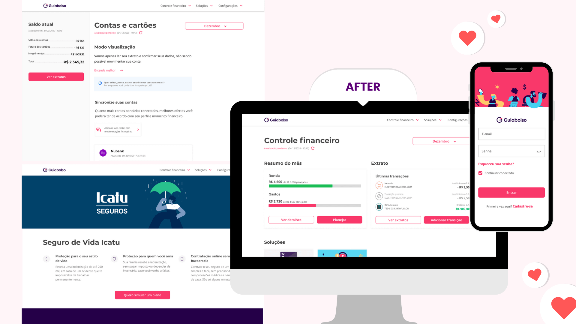
Before / After. The old logged-in web, sparse, inconsistent and hard to trust, rebuilt into a clear, consistent and responsive experience across the priority pages.
The outcome that made everything last.
A component library and clear guidelines, type, color, cards and patterns, built from scratch to standardize the interface, speed up delivery, and let the platform keep improving without creating new inconsistencies.
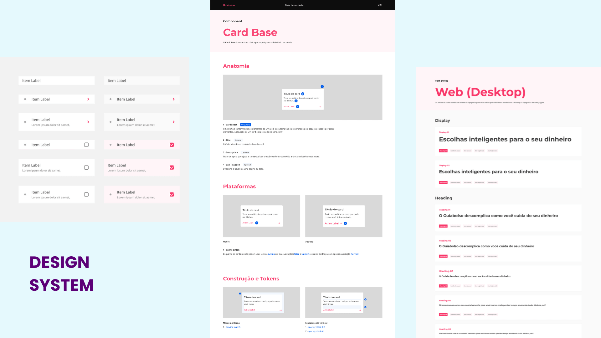
Pink Lemonade. The new web design system, components, card anatomy and a full desktop type scale, gave multiple teams a shared foundation to build on.
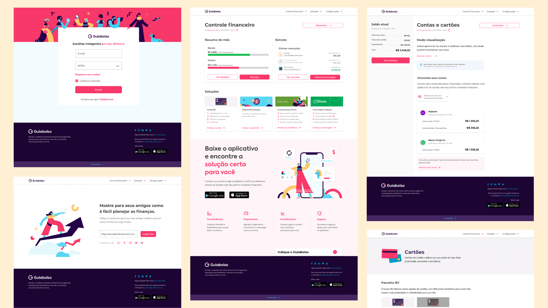
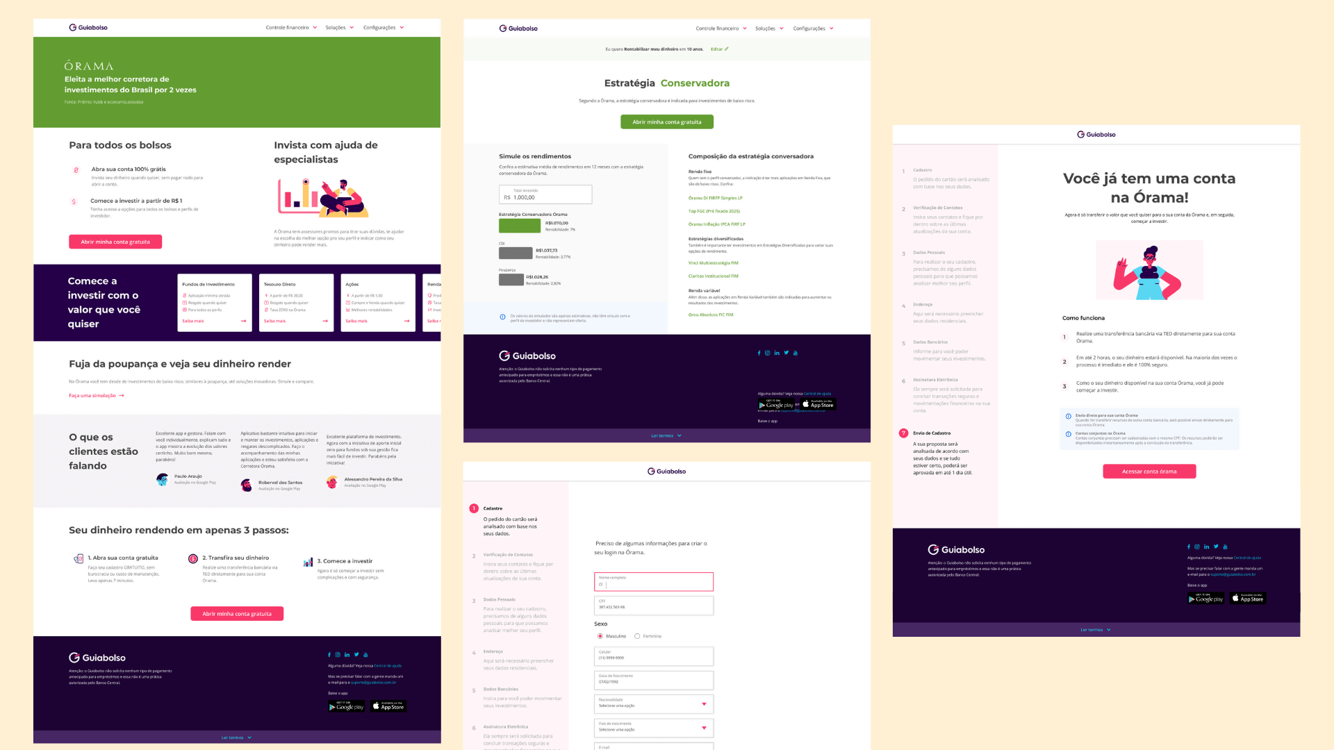
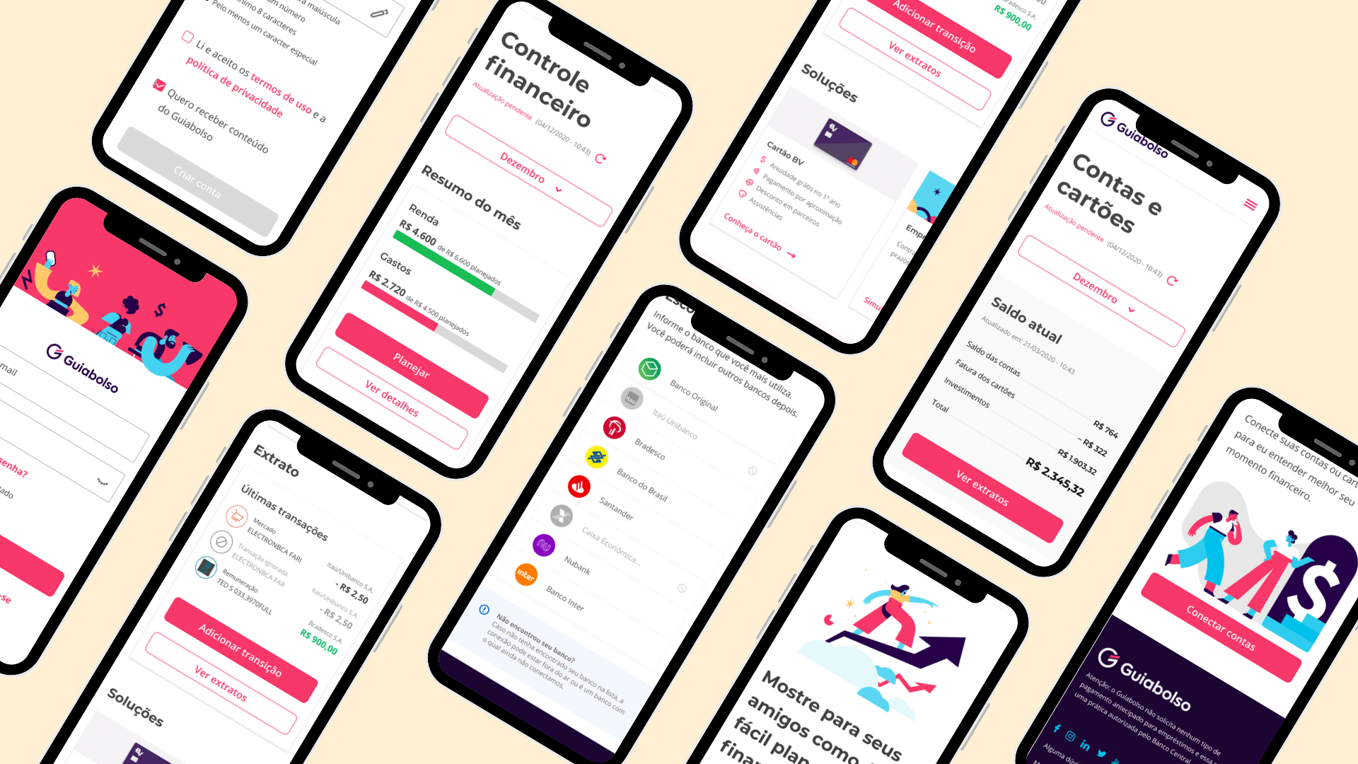
The new experience. Priority pages rebuilt end to end, login, accounts, cards, investments and onboarding, consistent and fully responsive from desktop to mobile.
What the work taught us.
Data-informed design focuses the team
It points everyone at what actually affects users, not what looks like a problem from the outside.
Two tools, one clear picture
Hotjar and Analytics together gave us far more than either could alone, the what and the why.
Modernizing UI isn't just aesthetics
When the interface feels clear and trustworthy, users decide with more confidence, and that shows up in conversion.
A design system makes the work last
It's not a bonus at the end. Without shared standards, every update risks undoing the consistency you built.
Behavior reveals what metrics hide
A page can have good numbers and still be confusing. The recordings showed us where, and why.
Evidence is what makes change stick
Intuition is a starting point. On complex platforms, decisions only last when they're built on real user data.
The results were measurable, but the most lasting one was the system.
The redesign improved usability and consistency across GuiaBolso's web platform, and the numbers moved with it: conversion up 20% and usability metrics up 35% across priority pages.
Conversion increased by 20% and usability metrics improved by 35% across priority pages. For a financial platform, where hesitation usually means abandonment, that shift in clarity and trust was the whole point.
But the most lasting outcome was a different one.
It was the design system. It gave the team a shared foundation to build on, making future improvements faster, more consistent, and easier to maintain across multiple teams. The redesign fixed today's pages; the system protects every page that comes next.
This project reinforced something important: in complex platforms with long roadmaps, design decisions only create lasting value when they're built on shared standards and driven by real user data. Intuition is a starting point. Evidence is what makes the change stick.