How design repositioned a financial product and generated millions in sales
Investment-Backed Credit lets customers borrow against their investments without redeeming them: the money stays invested and keeps growing. An excellent product that almost nobody was using. This is how research and design turned it around.

Itaú Unibanco is the largest private bank in Latin America, with around 100 million customers across 20+ countries.
This project focused on Investment-Backed Credit: a product that lets customers take out credit using their investments as collateral, without redeeming anything. Customers solve what they need without undoing what they built. In theory, an excellent product. In practice, only 0.28% of users ever interacted with it in the app.
One year later, a near-invisible product was moving millions per day.
A nearly invisible number, and three things going wrong at once.
Only 0.28% of users ever interacted with the product in the app. But it was never just one problem.
They didn't understand it
Reading “investment blocked as collateral,” the first thought was: they're locking up my money. Distrust won before any explanation could land.
The process blocked them
Between intent and signature, 3–4 days passed: emails to the guarantees team, an Excel sheet, an in-person signature. Customers lost momentum and redeemed first.
They needed evidence
It wasn't clear who the ideal customer was, what motivated sign-ups, or where people dropped off. Without that, continued investment was hard to justify.
Before redesigning a single screen, we needed to understand what was actually happening.
Investment is emotional
For customers, investment isn't just money, it's an achievement. Their biggest desire was to not touch what they had built. The product solved exactly that tension, yet it was communicated as just another type of credit.
The word “blocked” was destroying trust
On Reclame Aqui the pattern was clear: “what kind of logic is it to pay interest with my own money?” Loans were the most-complained category on both the App Store and Play Store. The language pushed people away before any explanation could reach them.
Different customers, different reasons
We identified four profiles. The one that converted most was the Entrepreneur: self-employed, financially literate, someone who sees credit as a growth tool, not an emergency. That profile became the focus of the redesign.
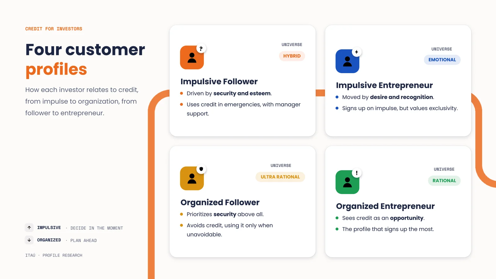
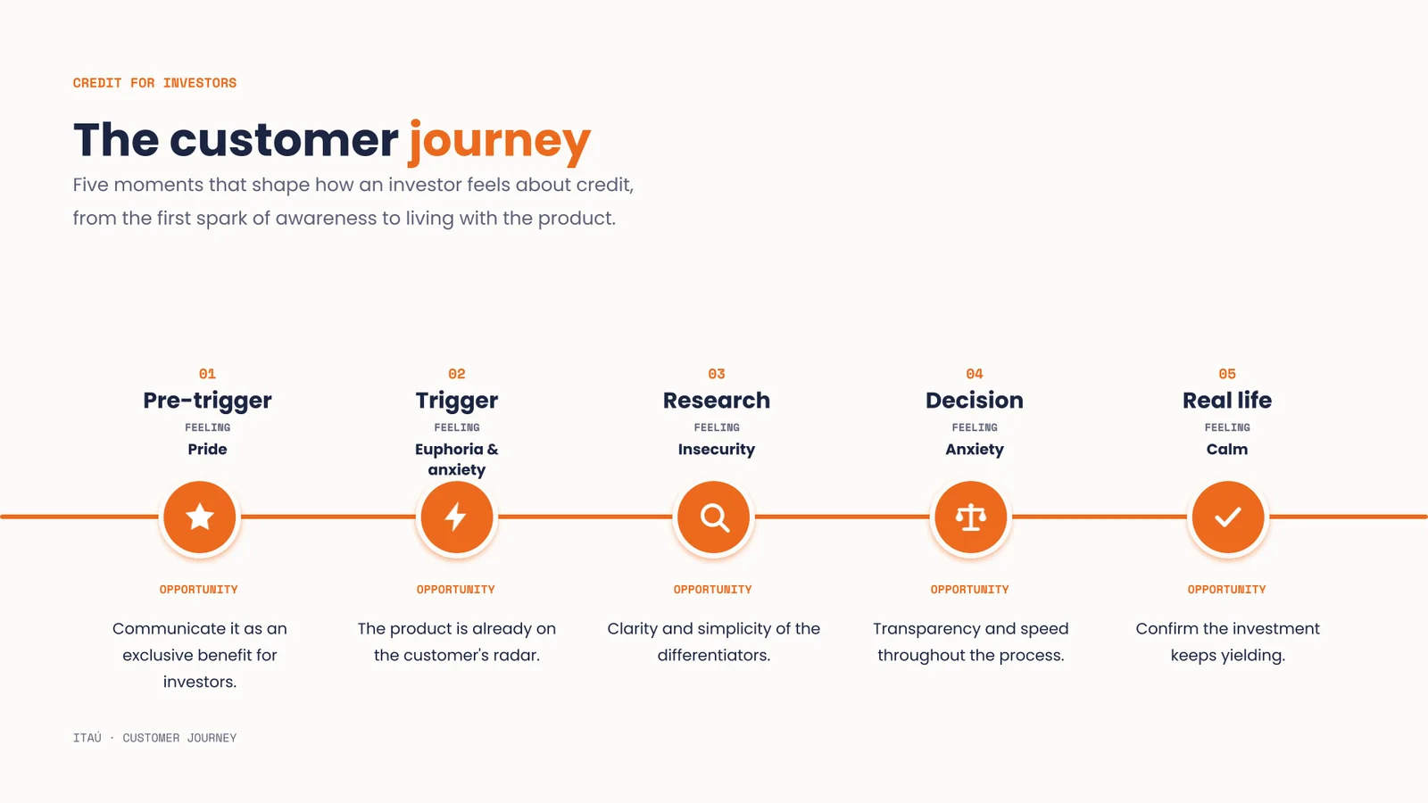
Profiles & journey. Four investor profiles and the five emotional moments that shape how they feel about credit, from pride to calm.
From 203 hypotheses to product decisions, prioritized with leadership.
Research & Discovery
Interviews, document analysis, competitor benchmarking and opportunity mapping.
Definition & Strategy
Hypotheses grouped into 16 strategic themes, prioritized with interdisciplinary teams.
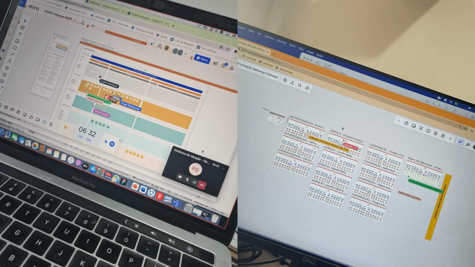
Co-creation & Ideation
Workshops with a CSD Matrix turned insights into product decisions with sign-off.
UX & Prototyping
Every screen decision tied to a research insight: new language, simulator, manager access.
Validation
Testing with real and visually-impaired users, plus a full accessibility spec.
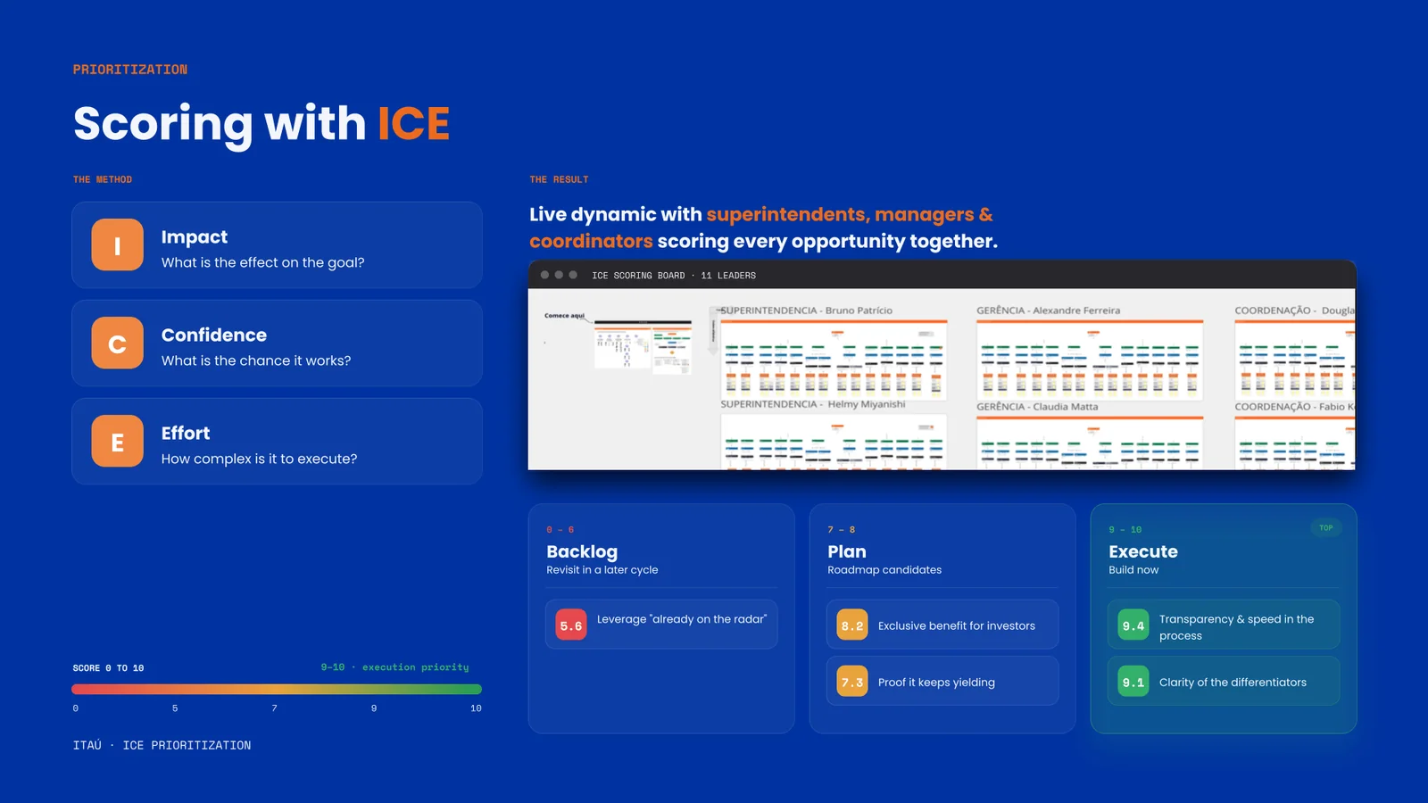
Prioritizing together. Opportunities scored live with 11 leaders: superintendents, managers and coordinators, using Impact, Confidence and Effort.
New language, the value proposition up front, and a full simulator on a single screen.
Every decision connected to a research insight. We replaced “blocked” with “to be used as collateral,” put a manager within reach throughout the flow, and made the whole simulation legible at a glance.
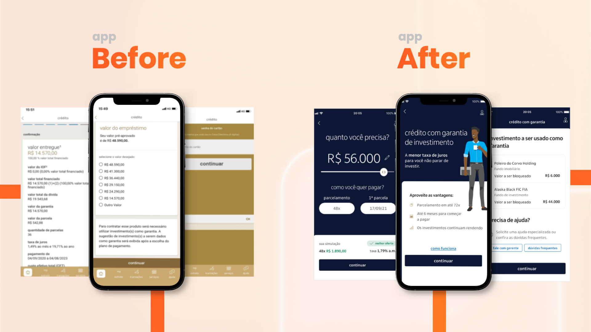
Before / After. The old multi-step crédito flow, rebuilt into a clear, guided experience with the offer and simulation in one place.
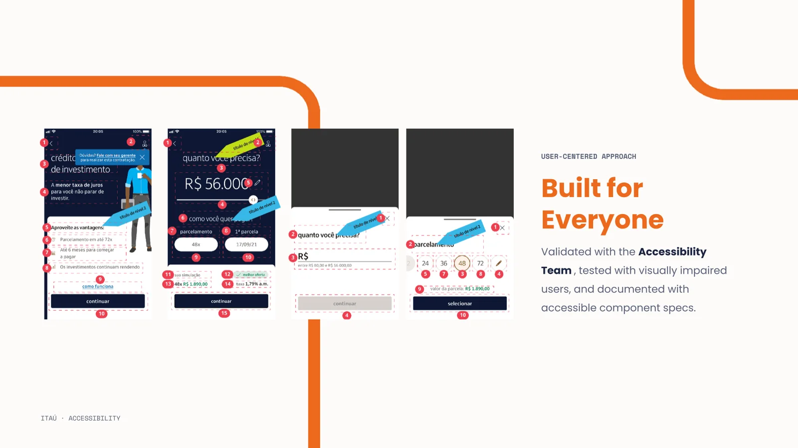
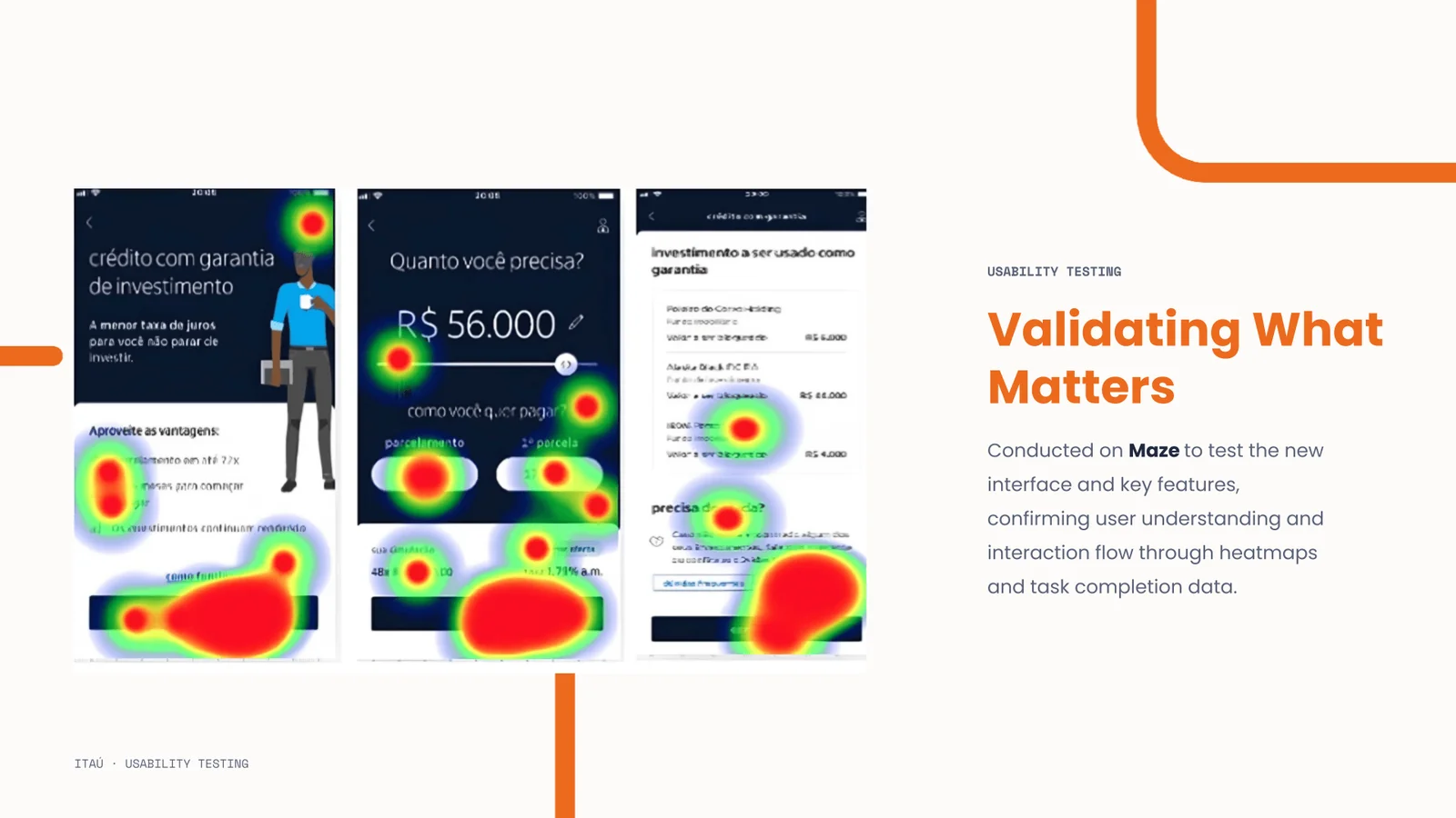
The new experience, validated. The end-to-end flow, documented with accessible component specs and tested on Maze: heatmaps and task-completion confirming understanding.
What the work taught us.
Investment is emotional
Customers don't want to touch what they built. The product solves that tension; it just needed to be communicated that way.
One word made the difference
Replacing “blocked” with “to be used as collateral” was simple, and transformative for trust.
Help belongs in context
Heatmaps showed a “Need help?” link in the footer worked better than a manager icon at the top.
Clarity drives adoption
92% of participants had no difficulty using the manager-access feature after the redesign.
More contracts ≠ more revenue
App sign-ups carried a lower average ticket than those closed with a manager.
Design can change strategy
The average-ticket insight led to a complete repositioning of the product, not just the interface.
The most important result wasn't the interface: it was the strategy.
During research we found the digital customer had an average ticket far below those who signed up with a manager. Growing mobile contracts didn't mean growing financial volume proportionally.
37% conversion rate in the mobile funnel. Over 10,000 digital contracts closed. R$ 4 million moved per day. Numbers that, a year before, felt impossible for a product that was barely touched in the app.
But the result that stayed with me was a different one.
During research, we found that the digital customer had an average ticket of R$ 34.6K, compared to R$ 67.2K from customers who contracted through a manager. That single data point, surfaced in a user interview, led the bank to redirect the product entirely to the Personnalité segment, making it exclusive to high-value investment clients.
Design didn't just improve one of the least accessed products in Itaú's investment area. It changed the strategic direction of that product's evolution. And that's what I believe design can do for a business: not only solve today's problem, but point toward where it's worth going next.