How design built the foundation for a new avatar app before launch
MetaverseME's Avatar ME! turns selfies into realistic 3D avatars. The app worked, but it wasn't ready to be seen: no design team, no visual direction, no documentation. This is how art direction and a scalable design system made it launch-ready.

MetaverseME is a European startup based in Malta, with collaborators in the UK, focused on digital self-expression through immersive experiences.
Their main product, the Avatar ME! app, transforms selfies into realistic 3D avatars using AI. When I joined, the company was preparing for its first public launch. Development was already advanced, but there was no design team, no visual direction, and no documentation. The app worked. It just wasn't ready to be seen.
A functional app became a launch-ready product with a system built to last.
The app was functional, but three things were going wrong at once.
The technology worked and the avatar experience was built. But opening the app, the visual design didn't match the ambition of the product.
The visuals weren't ready
The app looked unfinished. Layouts were inconsistent across screens, with no clear visual identity to anchor the experience or make users feel confident in the product.
No room to change how it worked
Development was advanced and the launch was close. Every improvement had to happen on top of what already existed, without touching backend logic or altering user flows.
Everything from scratch, fast
No documentation, no component library, no visual direction. And the avatar would be reused across other products, so whatever was built now had to hold up over time.
Before designing anything new, I reviewed everything that already existed.
The goal was not to redesign the experience. It was to understand what was already there well enough to improve it without breaking it.
A screen-by-screen audit
I analyzed the current layouts one screen at a time, mapping technical constraints and development dependencies, so improvements could be made without disrupting functionality or backend logic.
A digital-identity benchmark
I studied how other digital identity and avatar products approached visual design, looking for the contemporary, expressive language the category was moving toward, and where Avatar ME! could stand apart.
AI as an accelerator, not a decision-maker
I looked at how AI tools like Layer.ai could speed up visual exploration without replacing the design decisions that needed human judgment. The tool accelerates the process; the designer still makes the calls.
Competitor insights & visual direction. Mapping how digital-identity and avatar products handle visual language, the benchmark that grounded the creative direction for Avatar ME!
Improve what was there, without breaking what worked.
Context Analysis
Reviewed existing layouts, constraints and dependencies to find improvements that wouldn't disrupt functionality.
Defining the Vision
Developed a flexible art direction inspired by contemporary digital culture, built for clarity and scale.
Redesigning Key Layouts
Improved critical screens, onboarding and avatar creation, for better usability and visual consistency.
Building the System
Created a token-based design system for Unity, documenting components, spacing, typography and color.
Validation & Handoff
Validated through continuous feedback with developers and leadership, and planned a data-driven Phase 2.
A versatile Neo-Neon visual universe.
A flexible art direction inspired by contemporary digital culture, grounded in four interconnected visual pillars that build a sophisticated, emotionally engaging graphic language, scalable across every product that shares the avatar.
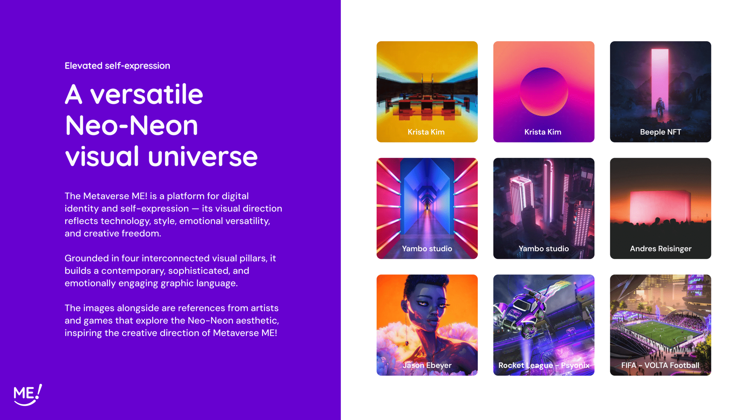
Art direction. References from artists and games that explore the Neo-Neon aesthetic, the creative anchor for technology, style, emotional versatility and creative freedom.
Legacy UI limitations.
Inconsistent visual language, weak hierarchy and unclear flows created friction across the experience. Outdated UI elements, low accessibility and a missing brand identity prevented emotional connection and scalability.
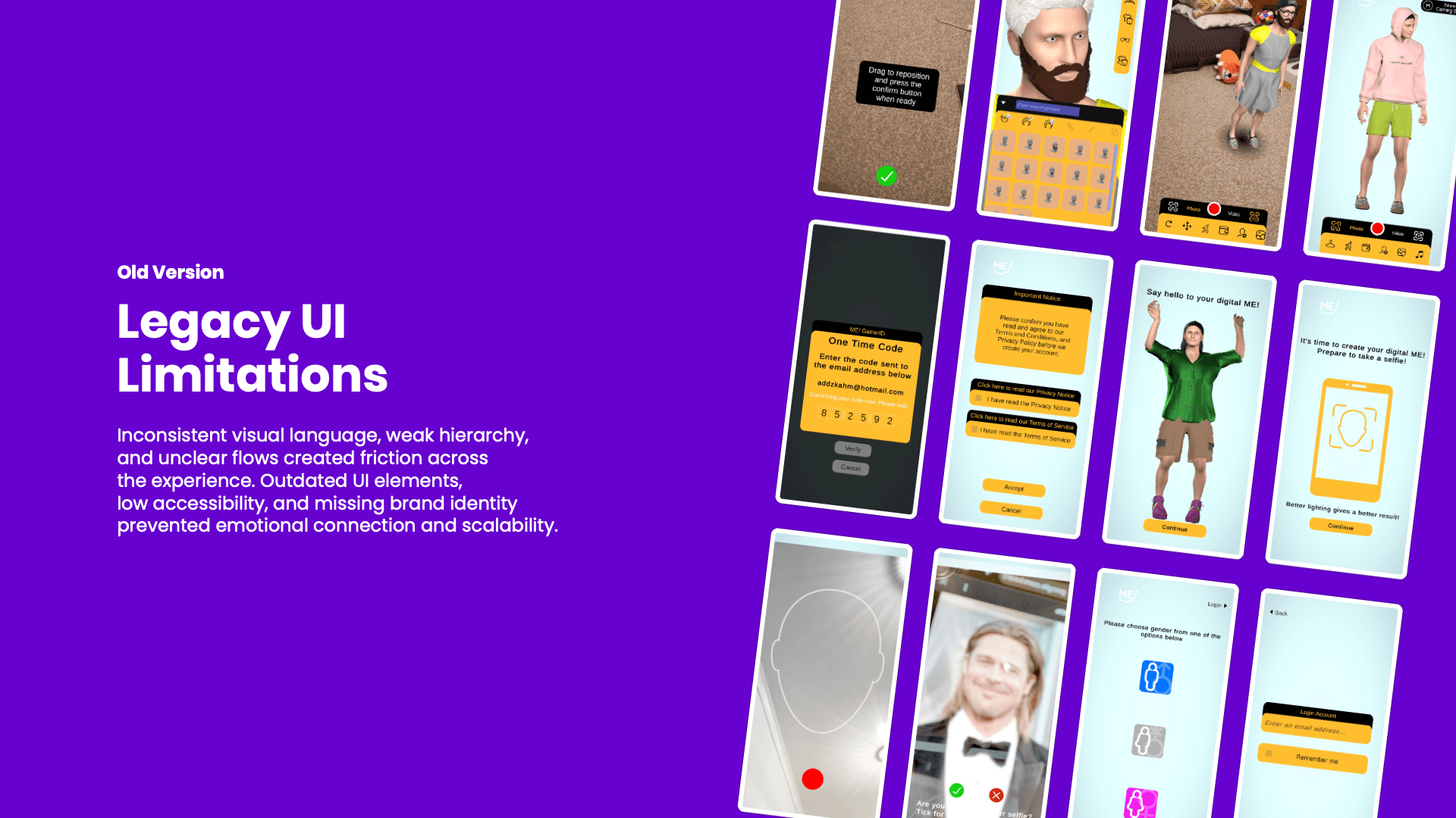
Before. A snapshot of the legacy onboarding and avatar-creation screens, functional, but without a shared visual language to anchor the experience.
A cohesive, expressive experience, flow by flow.
Onboarding, avatar creation, body selection and the AR experience, rebuilt with a consistent visual language and the new brand identity, all on top of the existing flows.
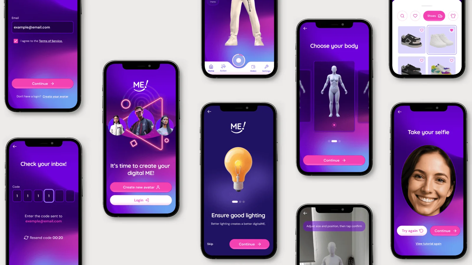
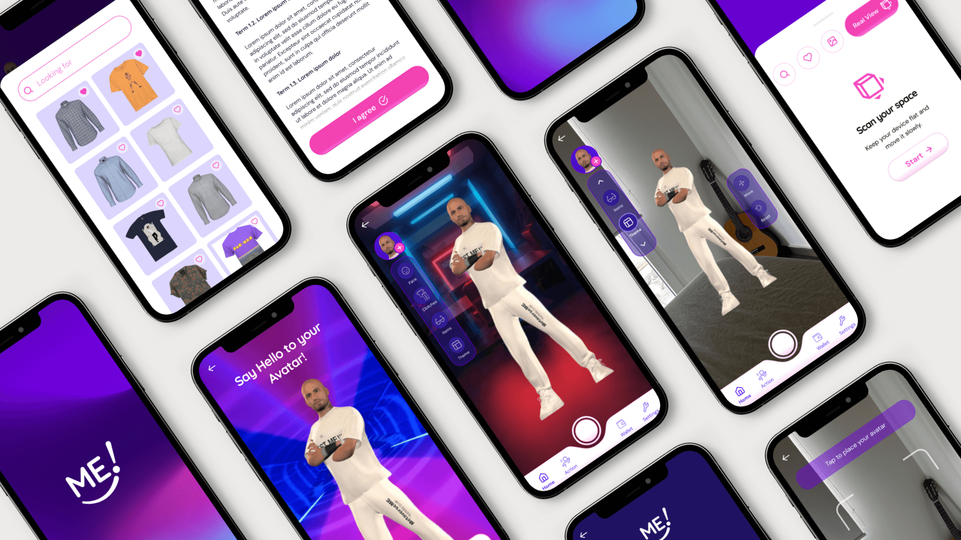
The new experience. From the redesigned onboarding and wardrobe to inclusive body selection and the interactive prototype, the full flow brought to life in the Neo-Neon language.
A token-based design system, built to scale.
A component library built for Unity, documenting spacing, typography and color so future teams could build on the same foundation, and so the avatar could travel consistently into other products.
Scalable foundation. Tokens, components and documentation, the shared language that lets MetaverseME extend the avatar experience to products like Kickoff Evolution without starting over.
What the work taught us.
Foundations beat a rushed redesign
In early-stage startups, a solid base lasts longer than a full overhaul under time pressure.
AI accelerates, the designer decides
Tools like Layer.ai speed up exploration, but they always need human direction and judgment.
Art direction guides every decision
More than aesthetics, it's a guide for every future call, especially where design is still being established.
Documentation is the legacy
When design isn't yet part of the culture, clear docs are what keep the work alive after the designer leaves.
A shared element needs a system
When several products share one avatar, consistency happens by design, never by accident.
Knowing what not to touch
The value came from discipline, protecting the flows that worked instead of redesigning everything.
More than screens, the real outcome was what was left behind.
The work established the first visual and structural foundation for the Avatar ME! app and for future MetaverseME products, all while keeping every existing flow intact.
The updated layouts improved clarity and consistency across the experience, and the design system created a scalable base that could grow with the company. AI tools accelerated exploration and documentation, while a clear creative direction kept quality and alignment on track.
This positioned MetaverseME to extend the avatar experience consistently to other products like Kickoff Evolution, maintaining visual continuity across teams in Malta and the UK.
But the result that stayed with me was a different one: more than the screens, what really mattered was a system, a direction, and a language the company could keep building on without starting over.
This project reinforced that design impact in early-stage products is not measured by how much you changed. It is measured by how much of what you built continues to work after you leave.